
Sierra Baguales.
Puerto Natales' Information Center is a privately-operated touristic information office. Located in the heart of Puerto Natales, it handles all sorts of enquiries about activities throughout the Magallanes Region in Chilean Patagonia: from day-trip excursions to Torres del Paine to multi-day activities to Last Hope fjord.
The goal of this brand is to be the main source of tourist-related information in one the most touristic cities in Chile, through brief, concise and knowledgeable people at the front desk.
Similarly, the design would recognize these elements and work within certain constraints, mainly retain a similar language to the parent brand: Natalis.

APPROACH
The triangle that contains the triskel was transposed to the first "N" and point North, a key element in guidance and orientation. The use of Proxima Nova delivers consistency and the added monotype Apercu Mono delivers a fact-based feeling.

Variants include: vertical, abbreviated stacking and simplified versions, as well as a rounded sign.

COLOURS
Colour-wise, the main (and perhaps the most obvious) choice was blue. An international signal for information, orientation and help, it also conveys security and calm. A complimentary orange was selected, to add energy and dynamism to the palette, while trying to get it as closely as possible to the "international orange" hue, used for critical safety protocols in the exploration and aerospace industry.
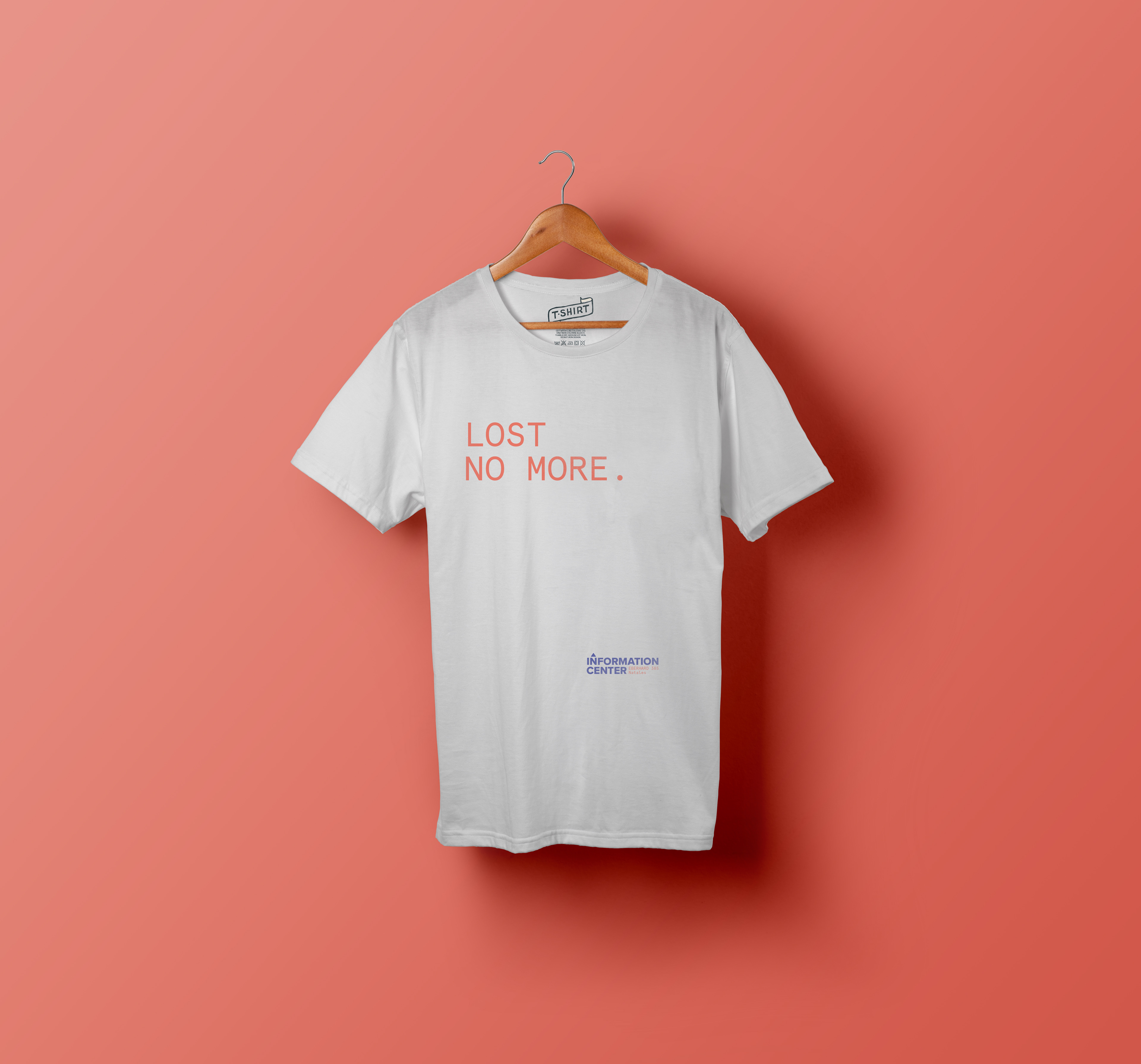
Proposed t-shirt for staff.
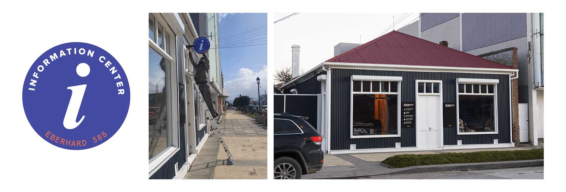
Final touches: an LED backlit sign and outer signs. Made in 10 mm steel to endure rain and vandalism, one was left deliberately empty so that staff can promote daily activities with markers.