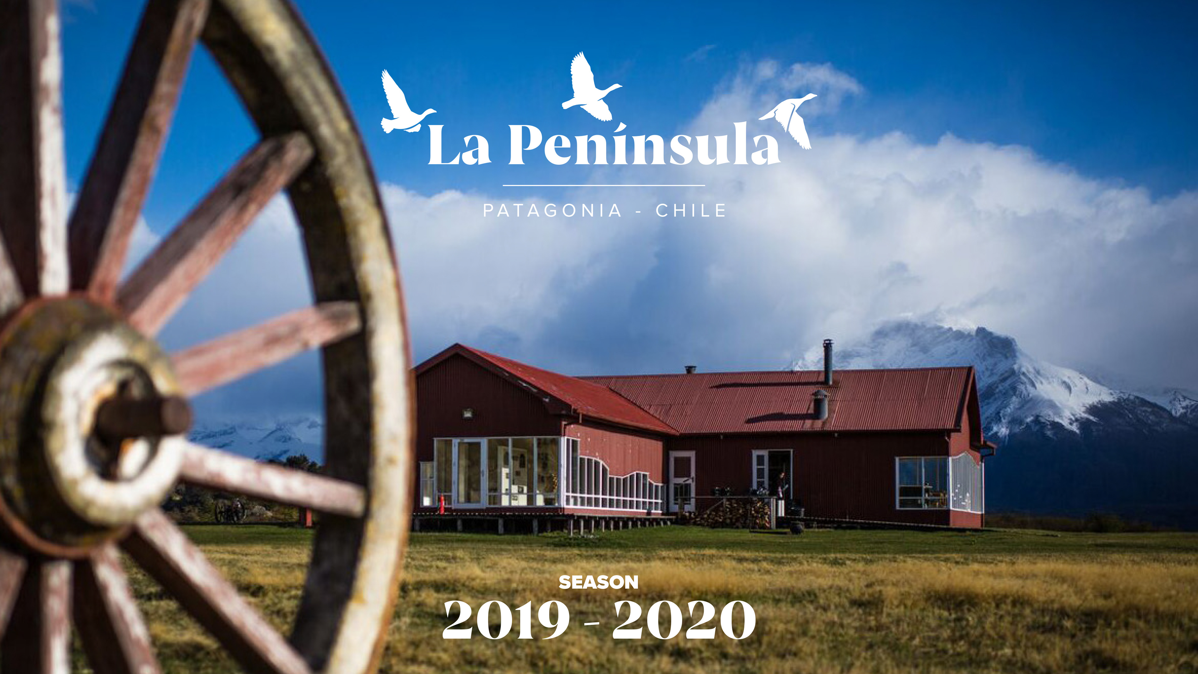
La Península is a family-owned estate dedicated to sustainable tourism in Chilean Patagonia.
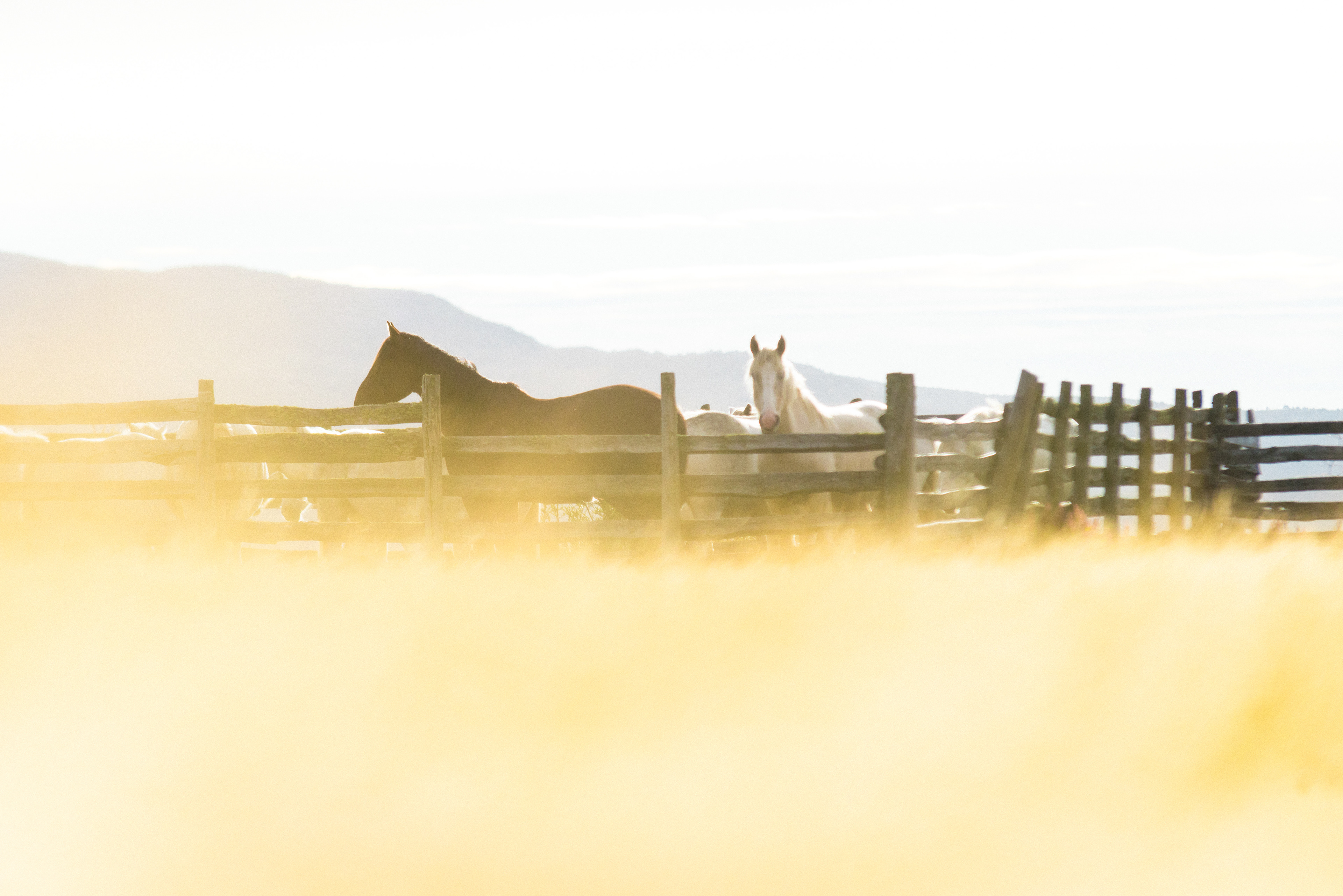
Once a cattle and logging farm, the estancia (ranch or estate) is now focused on sustainable tourism and conservation (80% of the property is dedicated to conservation), while farming is a minor part of their business.
Because of it's unique location and luxury-oriented services, it has become the best full-day tour in Chilean Patagonia.

In addition to La Península, they own and manage two more estancias in Patagonia and an independent information center in the city of Puerto Natales. The goal was to unify these three estancias, together with their parent company, Natalis, to portray a similar design language and style.
The aim of this project was to create a graphic brand identity system that caters to very basic standards: it needs to be rooted in Patagonian culture. It needs to be beautiful. It needs to make sense to people who live and work there. It needs to be functional.
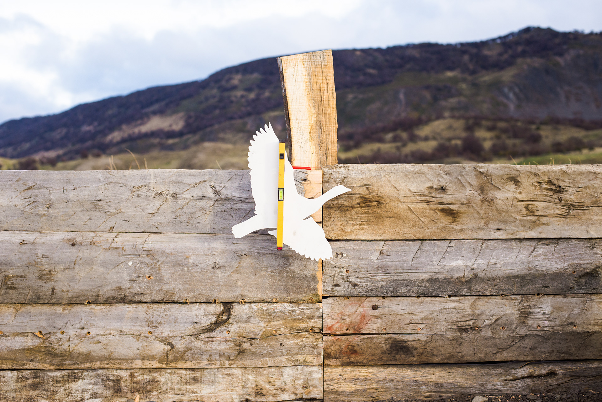
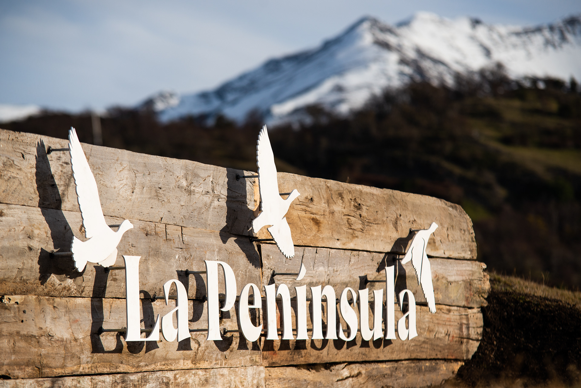
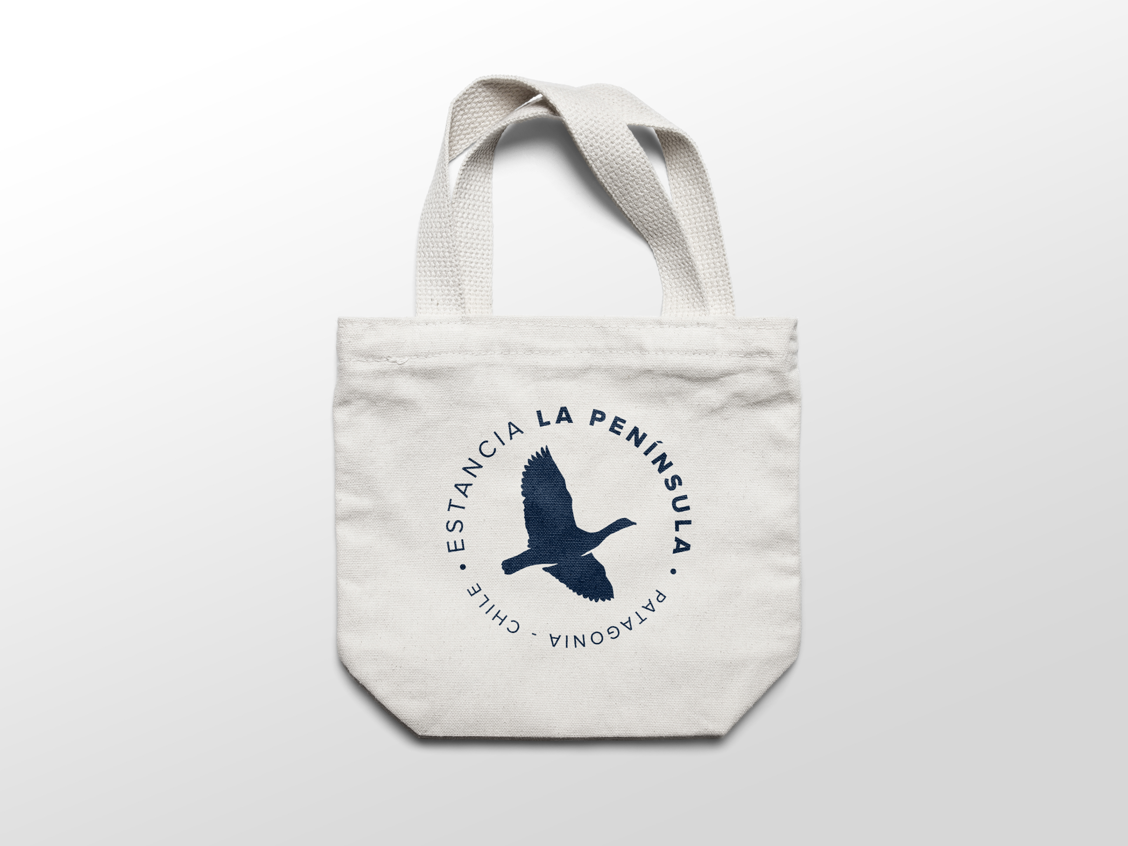
The isotype is based on a photograph taken on my first visit to the estancia, where we were greeted by a large quantity of upland geese. These birds, native to the region, form long-lasting family bonds and can be spotted all over Patagonia. This suited perfectly part of the narrative that we were aiming to show.
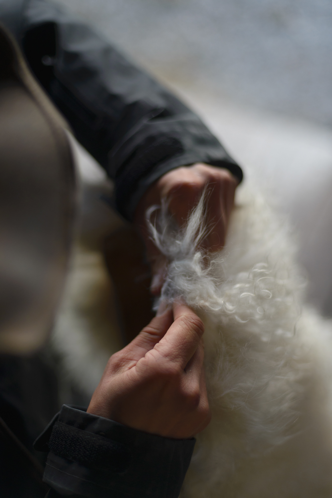
The logotype is a modern serif typeface, which relates to the widespread use of stencil plates to brand the wool bags, a key component in the region's history. Many immigrants arrived to Chilean Patagonia in the late 1800's and during a couple of decades, wool was one of the main exports of the region.

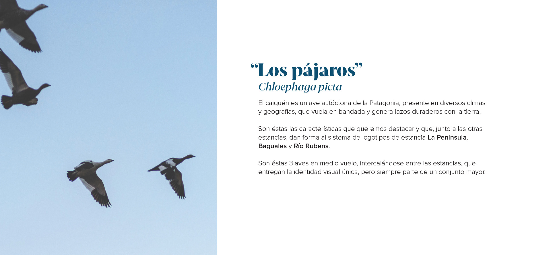
Excerpt from the brand manual, explaining the origin and meaning of the upland geese as the main icon for the estancia.
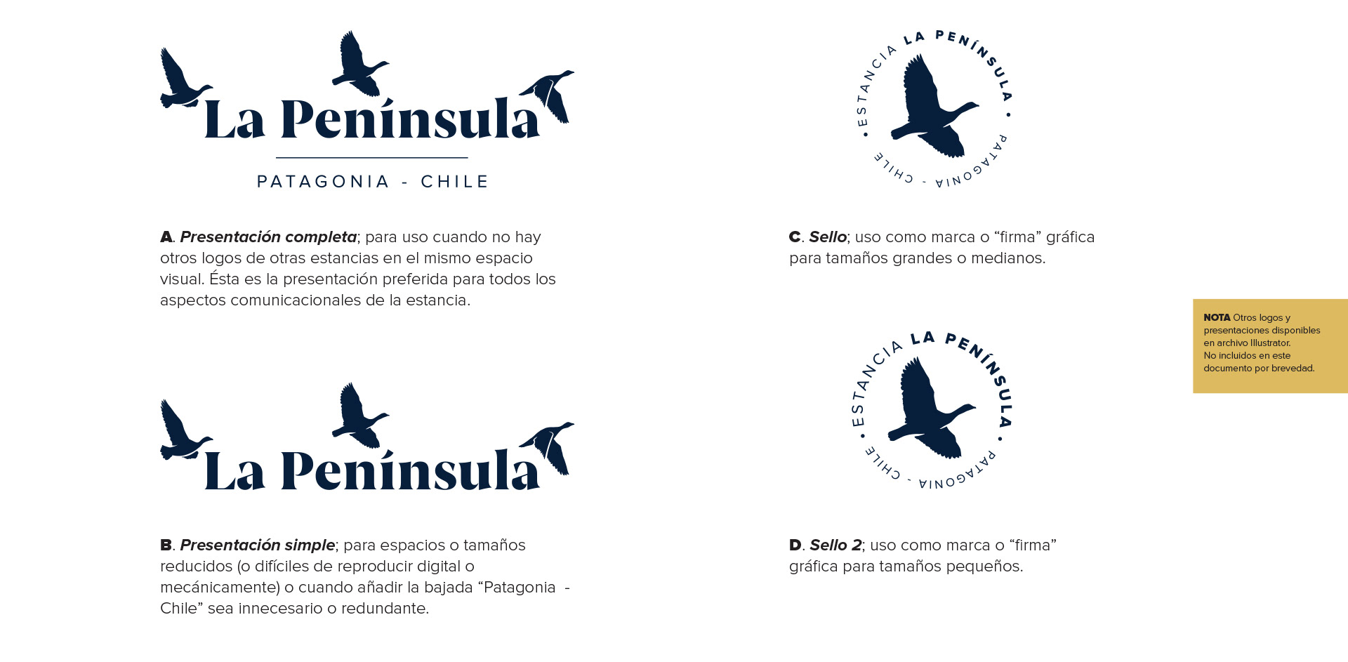
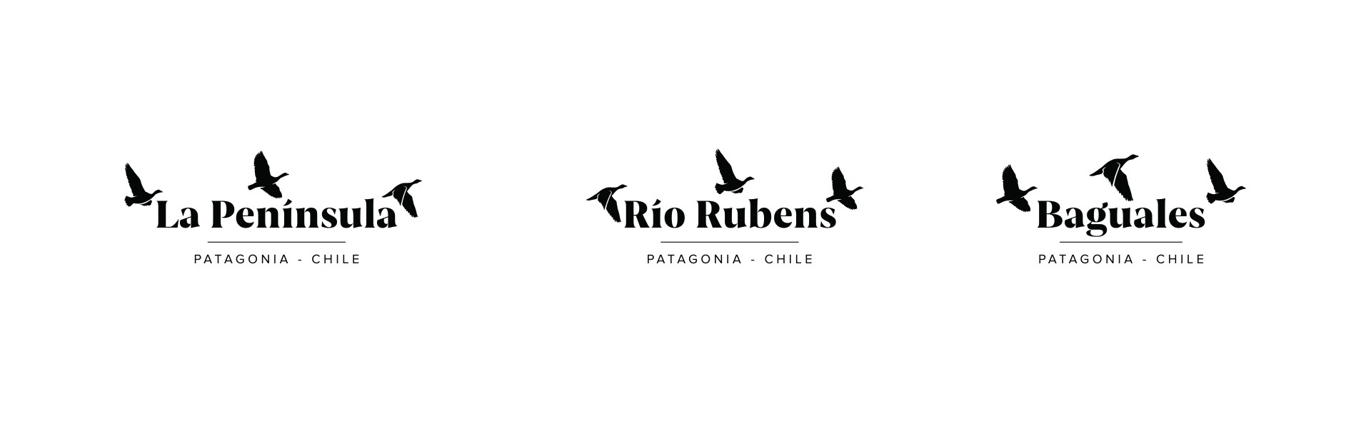
All three logos belong to separate places within the region.
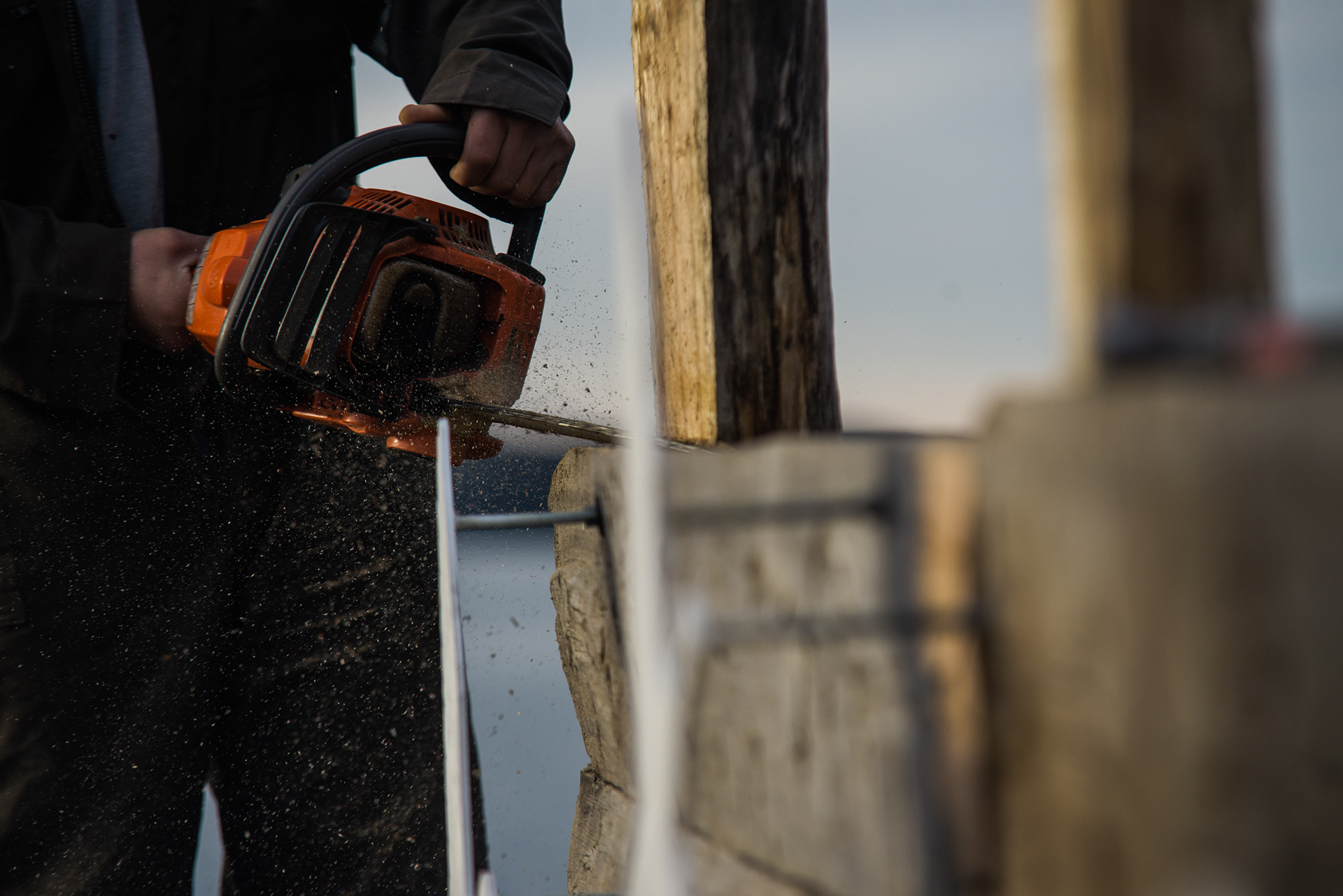
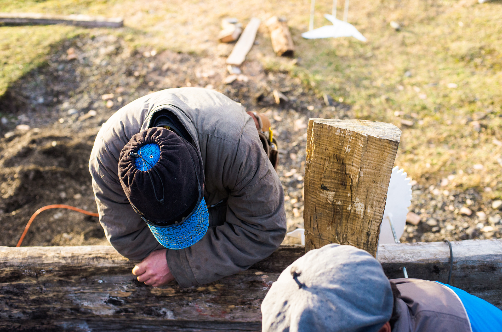
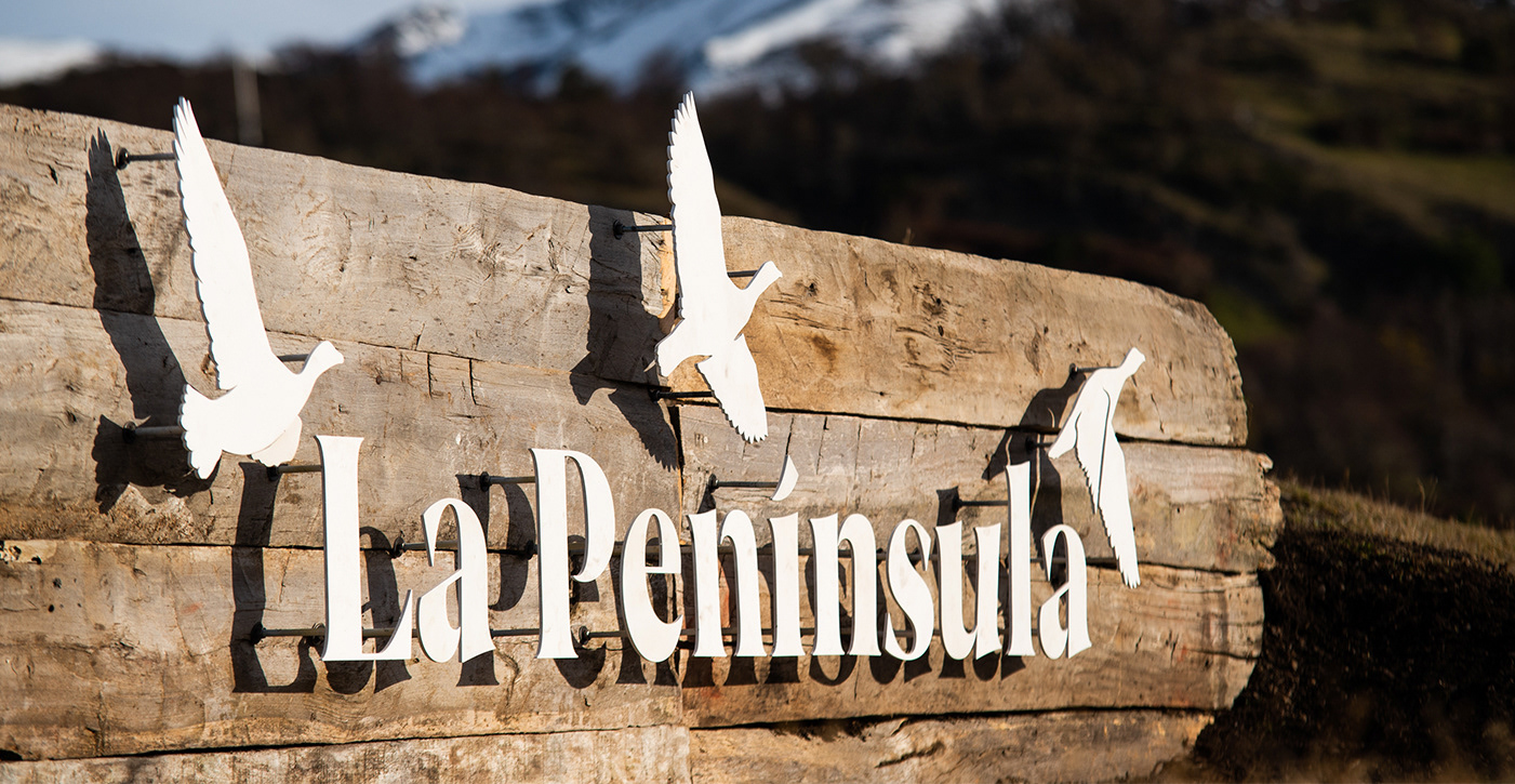
ENTRANCE SIGN
Built in 6mm cold-rolled metal, laser cut and assembled on location with repurposed wood.
Entering visitors are greeted by a small mound to their left, the estancia's main house in front of them and Monte Balmaceda and Last Hope sound to their right.
This mound was made to be seen as if it was al old loading bay, using decades-old planks from an old station, in front of which the letters were installed with outstanding precision.